
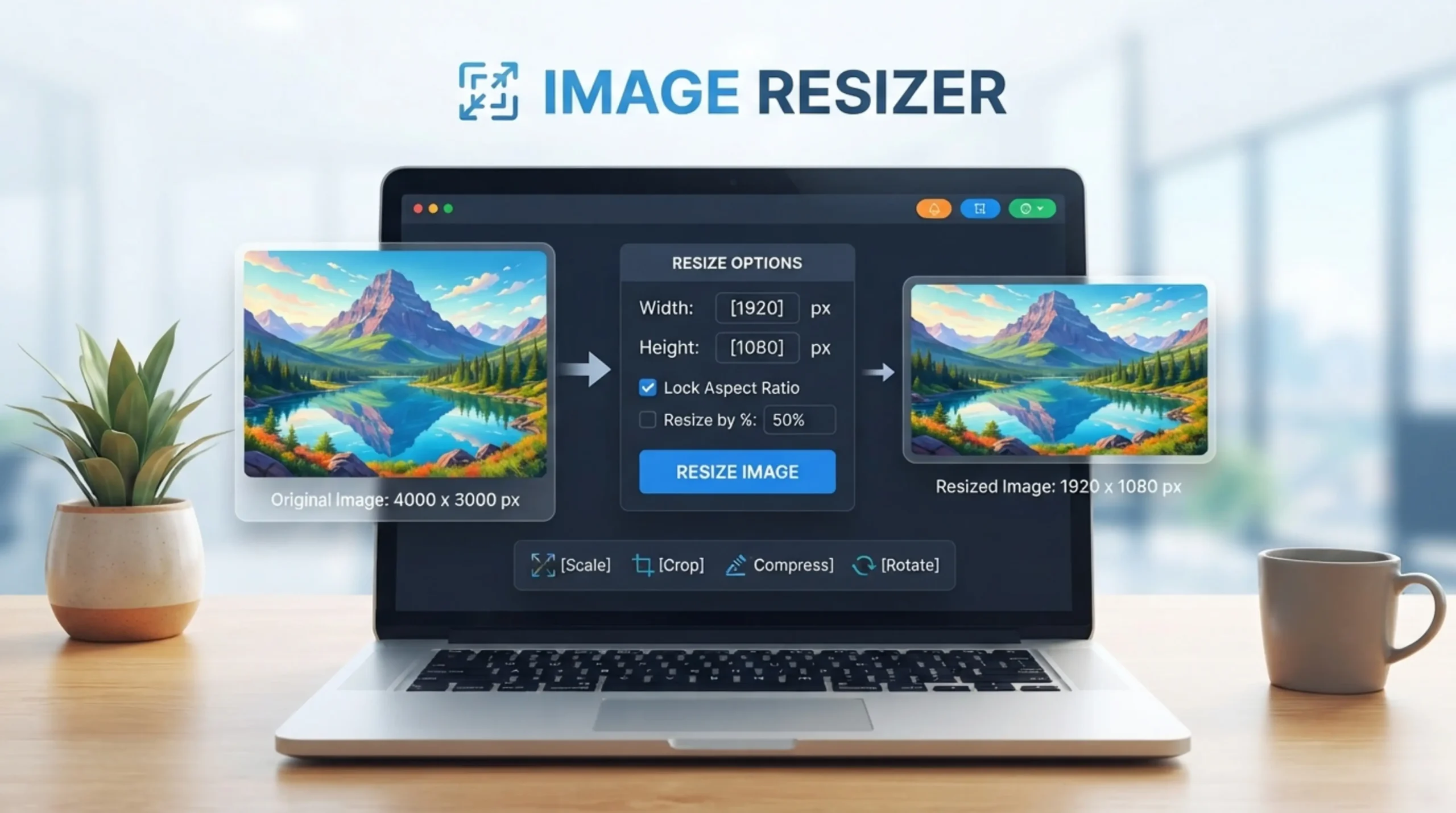
Original
Resized
Need Help Using Image Resizer
Resizing an image is changing the pixel dimensions. I mean height and width That makes him physically larger or smaller . What is free image resizer It’s a handy tool that enables you to set target sizes and automatically maintain the aspect ratio so you don’t end up with stretching or distortion of the image. Large images are one of the largest causes of slow loading pages and directly affect Core Web Vitals scores and search rankings. Mobile Responsiveness and Performance Resize your images to the size they will actually appear on your website and reduce the file size.
Resizing is changing the size of an image in pixels . It makes the image physically expand or contract, taller or shorter. Compression is the process of reducing the size of the file by encoding the pixel data more efficiently or by discarding detail that the eye doesn’t easily notice. Either way, the file size is smaller. These are complementary operations which solve different problems. First resize to get the dimensions you need for your use case, then compress to reduce file size and load faster. Most of the images need to be resized for the format and compressed to reduce the file size for social media. They have different problems and they complement each other.
Shrinking is normally lossless, so the result will be sharp and very close to the original. Scaling up is quite another thing. When you zoom in on a small image, the algorithm has to make up pixel data. This can result in a slight blur or softness when blown up large. “Always start with the highest resolution source you have and the result will always be better. Good source images are always helpful, makes a big difference to start off with a high res image. The more pixels the original image has, the more flexibility you have when scaling it. With a low quality image, it’s more likely to appear pixelated or blurry after you resize it, especially if you make the image larger.
Aspect ratio is width divided by height Image resolution: 1920 x 1080 Aspect ratio: 16:9 If you set 800×600 instead of 800×450, the ratio will be changed and the image will be stretched. Aspect ratio — the width to height ratio of a picture. The aspect ratio is important for the dimensions of an image. If you change the width or height of an image and do not maintain the aspect ratio the image will be distorted. Features will be stretched or compressed 3. Lock Aspect Ratio When Resizing Most image resizers have a lock option that automatically changes one dimension when you enter the other. Always resize images with the aspect ratio locked so they look natural.
Most blog images should be saved at a width between 1200 and 1600 px, at a resolution of 72-96 DPI. Save them as a WebP or JPEG file, with 80 percent quality compression, and try to keep the file size under 200 KB. So your page doesn’t slow down, and you get sharp rendering on retina displays. Hero images: 1200-1600 px Content images: 600-800 px Thumbnails: around 150 px. The optimum for images on the web is 72 dpi. The higher the resolution the larger the file. Doesn’t make it look any better on screen either. Aspect ratio should be preserved to avoid distortion on other devices and screen sizes
Images make up 40-44 percent of the total weight of a page. Slow loading images can increase bounce rates by as much as 32% and reduce conversions. Optimally sizing your images improves page speed, user experience and Google ranking. Since 58.21 % of the internet traffic is now thru mobile devices, Google is now focusing on mobile-first indexing — meaning that it favors the websites that perform well on smaller screens. So, your image resizing strategy needs to be mobile friendly. Page speed is a ranking factor, and images can greatly affect Core Web Vitals, which in turn can directly impact search rankings. Serve 2x resolution images Retina/HiDPI displays. If you see the image is 400px, then the source should be 800px. Use srcset to let browsers pick the right version.
It has common presets for social media platforms like Instagram, Facebook, LinkedIn, YouTube and others. You can also specify custom dimensions if you have something specific in mind. You choose how you want your image to fit the new size – crop to fill, fit within or stretch. This gives you full control over the look of your image after it has been resized. If you are going to upload an image on social media, share it through email, post it on your blog or put it on an eCommerce store then an image resize tool is a good friend to have. The image resize tool offers standard aspect ratio presets and social media channel presets like Instagram, Facebook, X, YouTube, Pinterest, and more all in one place
No need to look everyplace for a bulk image resizer. Resize multiple images at the same time with Canva Select the size you want and which pages of your design you want to resize. An online image resizer is a great tool for small business owners with multiple e-commerce channels and websites. Resize all photos to the same size in bulk for a consistent and professional look across all digital storefronts. All features and processing are totally free for up to 3 photos in a batch. Free image resizer. Batch processing with sophisticated algorithms ensures the highest quality. The mobile browser is fully supported on any smartphone or tab.
Pictures are uploaded with an SSL encrypted 256 bit secure connection and are automatically deleted after 6 hours. Since 2012, we’ve resized millions of images for free. There is no software to install, no sign ups, and no watermarks on your resized photos. Some tools will crop and resize images in the browser. Your images are never uploaded to our server so no one can access them. It runs on Windows, Mac, Linux or any device with a web browser. There are no signups, no file size limits and no annoying watermarks on your downloaded result. You don’t have to pay a dime for it.
One of the common mistakes people make when resizing images is upscaling low-resolution images, which causes pixelation and poor quality. No file size is too small. Big files make websites slow. I don’t give a damn about mobile devices. Make sure the images are optimized for every screen size. Not doing SEO (e.g. descriptive file names and alt text, etc.) There are many tools on the web that let you upload a large image and then visually resize it to the size you want it to display using CSS or HTML attributes. But your website still loads the whole image in the background. But the user’s browser must still download the original high-resolution image, which can have a negative impact on page speed and user satisfaction. The performance gains of real pixel level resizing are always real.