
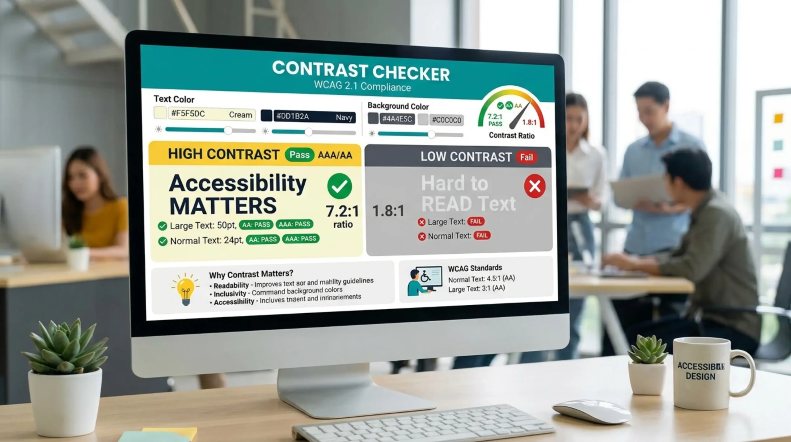
Need Help Using Color Contrast Checker
Color Contrast Checker is a tool that checks the color contrast ratio of the text and background colors for readability and accessibility. It checks whether the color combination is in the web accessibility standards such as WCAG (Web Content Accessibility Guidelines). Users can input or choose two colors and immediately check to see if they have sufficient contrast for visually impaired people. It helps designers, developers and content creators to create digital content that is accessible to everyone, including people with color blindness or low vision.
Color contrast is important for legibility, especially for people with visual impairments or color vision deficiencies. Enough contrast lets text and important elements stand out from their background. Poor contrast can make content hard to read, leading to a bad user experience and accessibility problems. Many regions legally require web content to follow color contrast guidelines. Good contrast helps not just users with disabilities but all users, particularly in low-light conditions or on small screens.
How Does A Color Contrast Checker Work A color contrast checker compares the luminance values of two colors – usually foreground (text) and background. It calculates the contrast ratio, which is usually between 1:1 (no contrast) and 21:1 (full contrast). Then it determines whether the ratio is compliant with the minimum requirements defined by accessibility guidelines like WCAG. Users can input or pick two colors, and the checker will tell you if it passes or fails, and what the ratio is exactly, so it’s easy to tweak colors to match.
WCAG ( Web Content Accessibility Guidelines ) defines minimum contrast ratios to ensure text is readable for people with visual impairment. The minimum ratio for normal text is 4.5:1. For large text (18pt or 14pt bold) it’s 3:1. Enhanced requirements ( AAA level ) 7:1 for normal text 4.5:1 for large text These ratios are for text and for images of text . These guidelines are important for web accessibility and are recommended for all web content authors.
Color Contrast Checkers are especially useful for web designers, developers, graphic designers, content creators and anyone else working in digital communication. They are especially important for those trying to comply with accessibility standards like WCAG or ADA for websites, apps, and digital documents. Educational institutions, government agencies and businesses that serve the public should use these tools to make sure their content is accessible to everyone, including people with visual disabilities.
Yes, color contrast checkers can be used to check the contrast of non-text components like icons, buttons and graphical elements, especially if they convey meaningful information. WCAG also includes contrast requirements for important graphical objects so that all users can see and interact with . Most checkers are designed to work on text , but many will allow you to check other UI elements by entering their colors or by using a color picker .
There are browser extensions for Chrome, Firefox and Edge that do check color contrast. With the help of the plug-ins you can see how web pages are rendered, highlighting contrast issues and offering suggestions for improvement. Some examples are: Axe, WCAG Color Contrast Checker and Color Contrast Analyzer. Extensions make it easier for developers and designers to identify browser accessibility issues as part of their day-to-day workflow.
Select colors that are very different in brightness and hue. This will give you more contrast of the foreground and background. Try out your choices with a Color Contrast Checker and adjust as needed to meet or exceed the WCAG guidelines. Dark on light, light on dark. Don’t mix similar colours Test your site on different devices and in different light conditions to make sure that it is readable for everyone.